
Research and Implementation of Data Visualization using Python
1. Introduction: The Importance of Data Visualization
 Figure 1: Visualization example
In modern data analysis, visualization is not merely presenting numbers as images, but an essential process to transform raw information into useful knowledge. As Cole Nussbaumer Knaflic stated in Storytelling With Data: A Data Visualization Guide for Business Professionals:
"Data visualization is the intersection of science and art. It's not just about creating pretty charts, but about understanding context, choosing the right display, and eliminating clutter to focus on the core message."
Ignoring the visualization step and relying solely on aggregate statistical indicators can lead to serious errors in identifying the nature of phenomena and making biased decisions.
1.1. Empirical Analysis through Anscombe's Quartet
To demonstrate the importance of observing data visually, statistician Francis Anscombe constructed four datasets (denoted as I, II, III, IV). Although these datasets have completely different data point structures, they possess nearly identical descriptive statistical characteristics.
Raw Data and Descriptive Statistics
Before observing through charts, reviewing raw data and statistical indicators is the first step in the analysis process. The table below details the $(x, y)$ coordinate pairs of the four datasets:
| No. | Set I (x) | Set I (y) | Set II (x) | Set II (y) | Set III (x) | Set III (y) | Set IV (x) | Set IV (y) |
|---|---|---|---|---|---|---|---|---|
| 1 | 10.0 | 8.04 | 10.0 | 9.14 | 10.0 | 7.46 | 8.0 | 6.58 |
| 2 | 8.0 | 6.95 | 8.0 | 8.14 | 8.0 | 6.77 | 8.0 | 5.76 |
| 3 | 13.0 | 7.58 | 13.0 | 8.74 | 13.0 | 12.74 | 8.0 | 7.71 |
| 4 | 9.0 | 8.81 | 9.0 | 8.77 | 9.0 | 7.11 | 8.0 | 8.84 |
| 5 | 11.0 | 8.33 | 11.0 | 9.26 | 11.0 | 7.81 | 8.0 | 8.47 |
| 6 | 14.0 | 9.96 | 14.0 | 8.10 | 14.0 | 8.84 | 8.0 | 7.04 |
| 7 | 6.0 | 7.24 | 6.0 | 6.13 | 6.0 | 6.08 | 8.0 | 5.25 |
| 8 | 4.0 | 4.26 | 4.0 | 3.10 | 4.0 | 5.39 | 19.0 | 12.50 |
| 9 | 12.0 | 10.84 | 12.0 | 9.13 | 12.0 | 8.15 | 8.0 | 5.56 |
| 10 | 7.0 | 4.82 | 7.0 | 7.26 | 7.0 | 6.42 | 8.0 | 7.91 |
| 11 | 5.0 | 5.68 | 5.0 | 4.74 | 5.0 | 5.73 | 8.0 | 6.89 |
Basic statistical indicators calculated for all four datasets show similarity up to the second decimal place:
| Statistical Indicator | Value |
|---|---|
| Number of Observations ($n$) | 11 |
| Mean of variable $x$ ($\bar{x}$) | 9.0 |
| Mean of variable $y$ ($\bar{y}$) | 7.50 |
| Variance of variable $x$ ($s^2_x$) | 11.0 |
| Variance of variable $y$ ($s^2_y$) | 4.12 |
| Pearson Correlation Coefficient ($r$) | 0.816 |
| Linear Regression Equation | $y = 3.00 + 0.500x$ |
Visualization Results
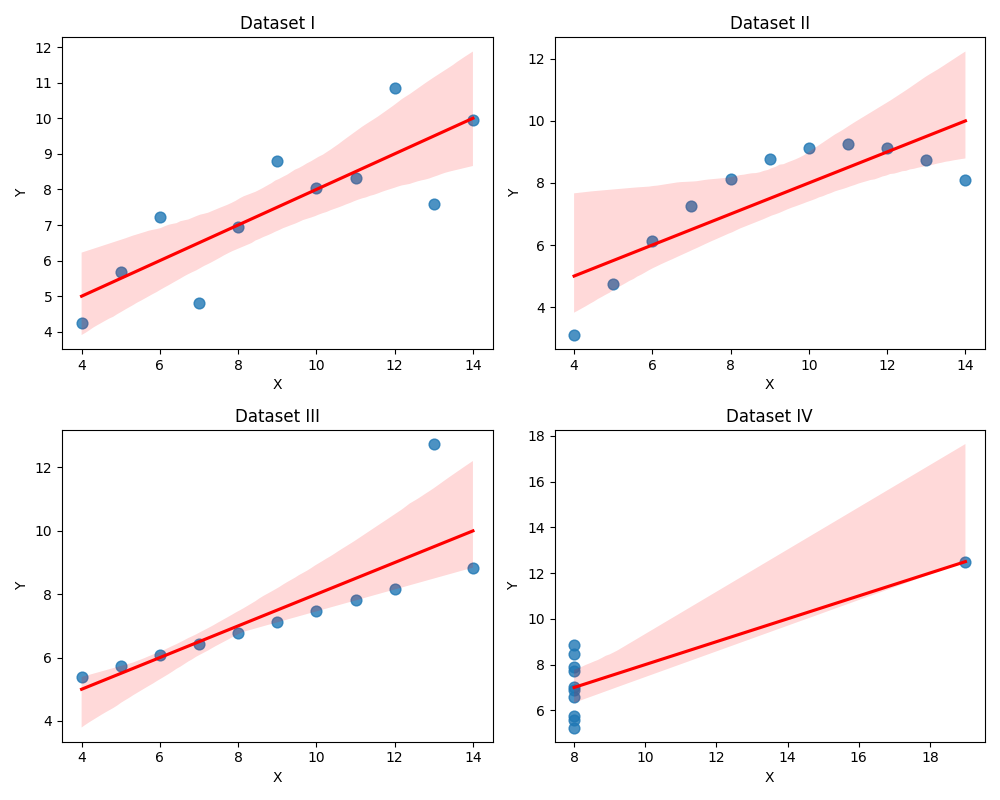
Figure 2: Anscombe data visualization.
However, when plotting scatter plots combined with regression lines, the fundamental differences between the datasets are clearly revealed:
- Dataset I: Follows a linear model with a certain standard deviation around the regression line. This is an ideal case for simple regression algorithms.
- Dataset II: Data shows a clear non-linear relationship (parabolic). Applying a linear model here is inappropriate and leads to large prediction errors.
- Dataset III: A perfect linear relationship exists but is skewed by an outlier far from the main axis, significantly altering the slope of the regression line.
- Dataset IV: Shows an unusual data structure where $x$ values are constant (except for one), meaning the regression model does not correctly reflect the actual trend of most data.
The conclusion from this experiment confirms that: Data visualization is a mandatory step to verify statistical assumptions before proceeding with in-depth analysis.
1.2. Python Library Ecosystem: Matplotlib and Seaborn
In the Python programming environment, visualization implementation is primarily supported by two central libraries:
- Matplotlib: Acts as the foundational (low-level) library, providing APIs to adjust detailed chart structures, from coordinate axes to complex geometric properties.
- Seaborn: A high-level library built on Matplotlib. It is optimized for statistical analysis, directly supports Pandas DataFrame structures, and automates graphic aesthetics, making the workflow more efficient.
2. Common Chart Types and Practical Applications
To ensure our exploration of data visualization isn't dry or purely theoretical, we will practice drawing these charts using a real-world dataset: student_performance_interactions.csv (Student performance data). Applying this to an actual analysis problem will help us easily visualize which chart to use to answer which question, while also uncovering interesting insights hidden behind the numbers.
To achieve good performance, we group the features as follows:
Learning history (4 features):
previous_score: Overall previous average.math_prev_score: Previous Math score.science_prev_score: Previous Science score.language_prev_score: Previous Language score.
Study behavior (3 features):
daily_study_hours: Self-study hours per day.attendance_percentage: Attendance rate (%).homework_completion_rate: Homework completion rate (%).
Lifestyle & Health (3 features):
- sleep_hours: Sleep hours per night.
- screen_time_hours: Screen time hours.
- physical_activity_minutes: Physical activity minutes per day.
Psychology (2 features):
motivation_score: Study motivation score.exam_anxiety_score: Exam anxiety score.
Environment & Family (2 features - require encoding):
parent_education_level: Parent education level (categorical).study_environment: Study environment (categorical: Quiet, Moderate, Noisy).
Let's start with the first group of charts:
Comparison Data
This group of charts is used when you need to compare differences in magnitude, quantity, or proportion across various categories or groups.
2.1. Bar Chart: Comparing values across categorical groups
The bar chart is the perfect and most popular tool when you want to compare a specific metric across distinct groups.
- Exploring with Matplotlib:
Suppose we want to answer the question: "How does the study environment affect a student's final score?"
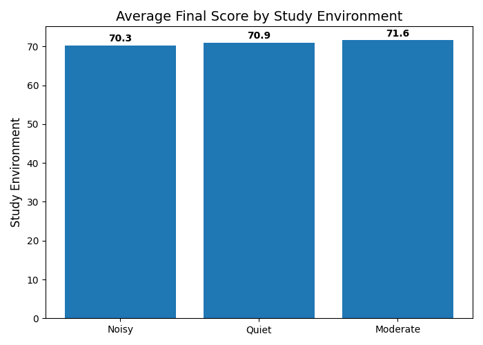 Figure 3: Scores by study environment.
💡 Interesting insight from the chart: Intuitively, we often assume a "Quiet" environment will yield the best results. However, looking at the actual chart, students studying in a "Moderate" environment have the highest average score (71.59 points), slightly edging out the Quiet (70.94) and Noisy (70.26) groups. This is clear proof of why data analysis must rely on actual charts rather than guesswork!
- Exploring with Seaborn:
Seaborn helps us take it a step further with multidimensional comparisons. This time, we want to examine scores based on the Parent's Education Level, but we also want to break it down further by Study Environment to see if there's any interaction between the two.
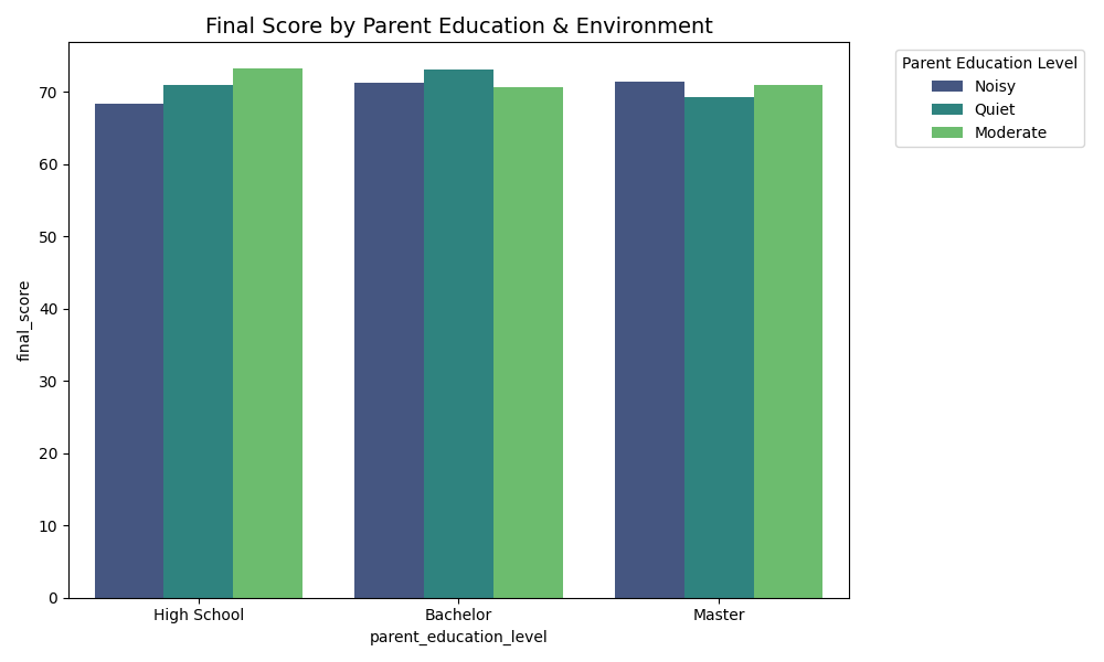 Figure 4: Scores by parent education and environment.
2.2. Line Chart: Tracking changes and trends
Although line charts are most commonly used for time-series data, they are still incredibly effective when you want to illustrate the continuous change of one variable relative to another quantitative variable (e.g., as variable X increases, what trajectory does variable Y follow?).
- Exploring with Matplotlib:
We use Matplotlib to track the trend of the Final Score as a student's Daily Study Hours gradually increase.
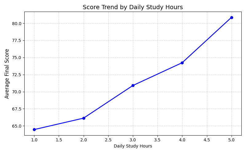 Figure 5: Score trend by study hours.
- Exploring with Seaborn:
With Seaborn, we will analyze the impact of Attendance Percentage on the final score.
In reality, at the exact same attendance rate, multiple students will achieve different scores. Instead of drawing a messy zigzag line from one point to another, Seaborn automatically calculates and plots a smooth average trajectory. Even better, it automatically surrounds that average line with a shaded band—this represents the "confidence interval" in statistics. It allows you to instantly assess the variation and dispersion of the data at each attendance milestone.
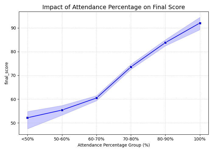 Figure 6: Impact of attendance on scores.
Data Distribution Analysis
This section focuses on data distribution charts — one of the most important tools to clearly understand how our data is distributed. Unlike the "Comparison" group that focuses on contrasting groups, the "Distribution" group helps us answer questions like:
- "How is the data distributed?"
- "How many outliers are there?"
- "Does the data follow a normal distribution?"
2.3. Histogram: Frequency of Value Ranges
Histograms display the frequency of occurrence for different value ranges (bins) — they help us visualize the "shape" of our data intuitively.
Experience with Matplotlib vs Seaborn:
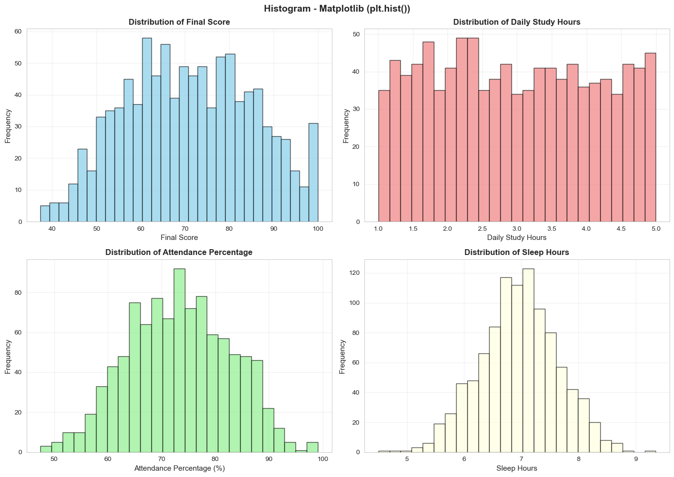 Figure 7: Histograms of key variables.
Matplotlib (plt.hist()): Simple and fast. From the chart:
- Final Score: Fairly even distribution from 40-100, concentrated at 60-80
- Daily Study Hours: Most students study 1-3 hours/day, some study 4-5 hours (very diligent)
- Attendance: Two clear groups: 60-70% (inconsistent) and 85-95% (diligent)
- Sleep Hours: Most sleep 6-8 hours/day (reasonable)
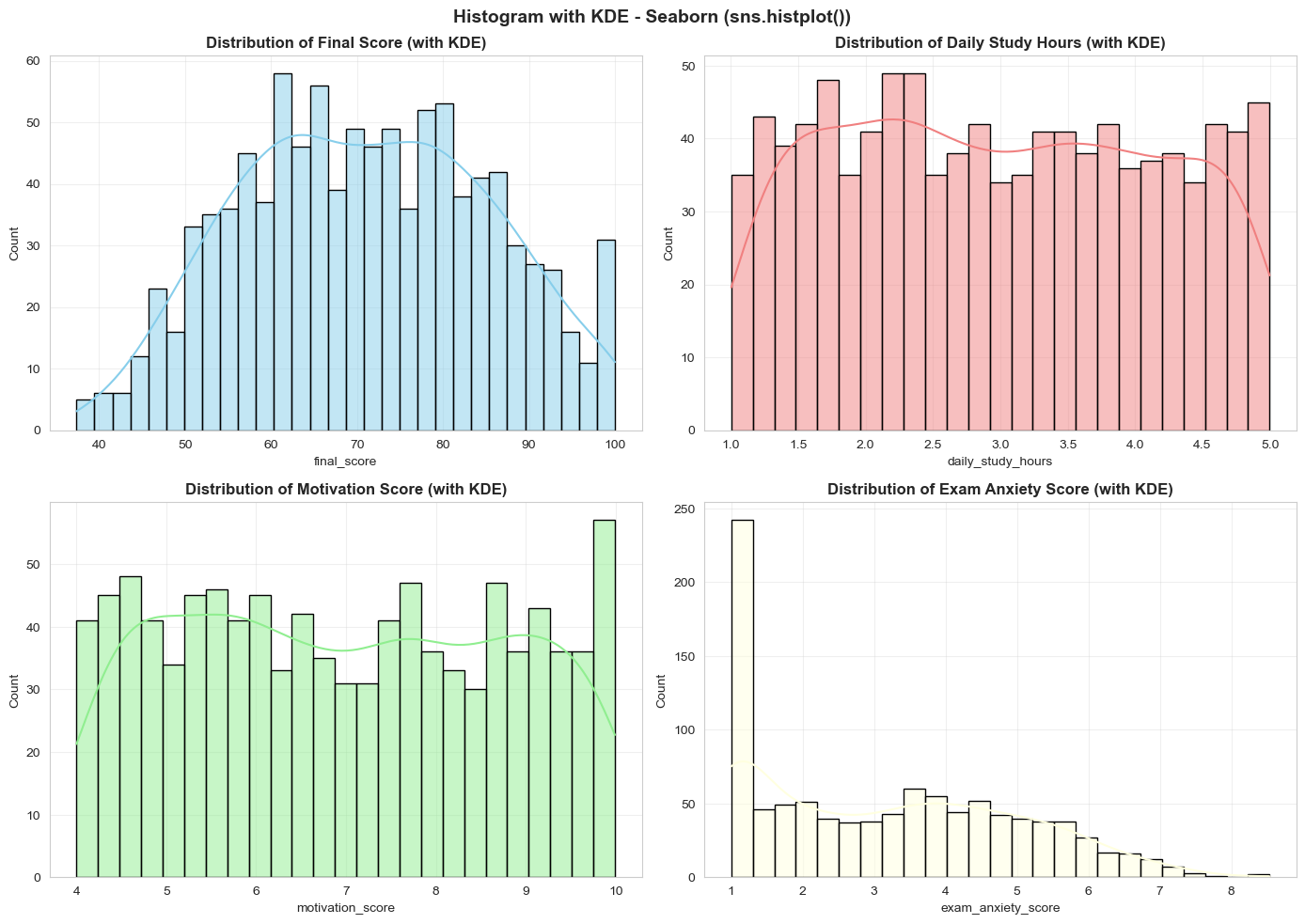 Figure 8: Histogram with KDE.
Seaborn (sns.histplot + KDE): Adds KDE curve for clearer distribution shape identification
- Final Score: Nearly normal distribution, slightly left-skewed
- Motivation Score: High concentration (4-9), showing most students are motivated
2.4. KDE Plot: Understanding Distribution Shape
If Histogram is a "brick wall photo," then KDE Plot is a "smooth painting" of the same image. It's the perfect tool when you want to focus on the distribution shape without worrying about minor details.
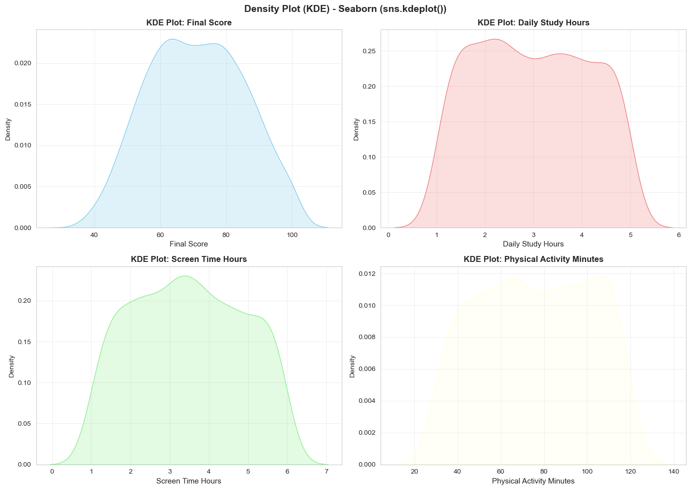 Figure 9: Distribution shapes with KDE.
Key Insights from KDE Plots:
- Final Score: Nearly symmetric curve with mode around 60-70 points
- Daily Study Hours: Right-skewed distribution, concentrated at 1-3 hours
- Physical Activity Minutes: Two "centers" — one group prefers sitting (30-60 min) and another prefers exercise (90-120 min)
2.5. Boxplot: Detecting Outliers and Comparison
The Boxplot is one of the most powerful tools for understanding data structure:
- Box: Contains 50% of the data in the middle (from Q1 to Q3)
- Horizontal line inside box: The median (Q2)
- Long lines above and below: The "whiskers" - contain approximately 95% of the data
- Isolated red dots: Outliers — unusual data points
Univariate Boxplot:
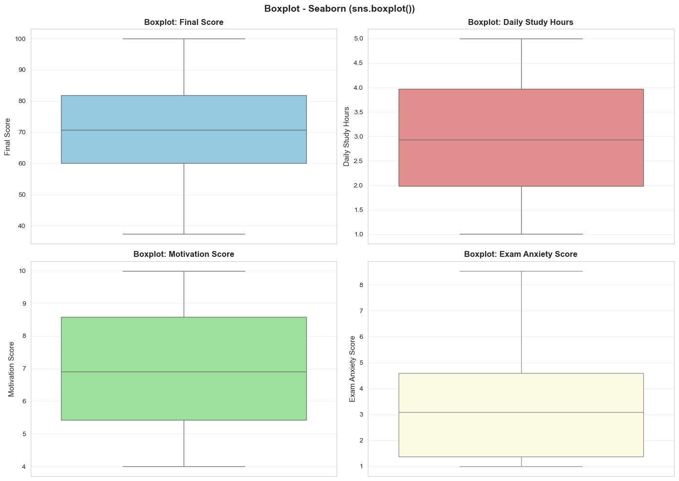 Figure 10: Univariate boxplot and outliers.
- Final Score: Few outliers; well concentrated from 45-95
- Daily Study Hours: Some outliers at both ends (very little or very much)
- Motivation Score: Mostly 3-8; below 1.5 need motivation boost
- Exam Anxiety: Some students have very high anxiety (>9)
Boxplot by Category:
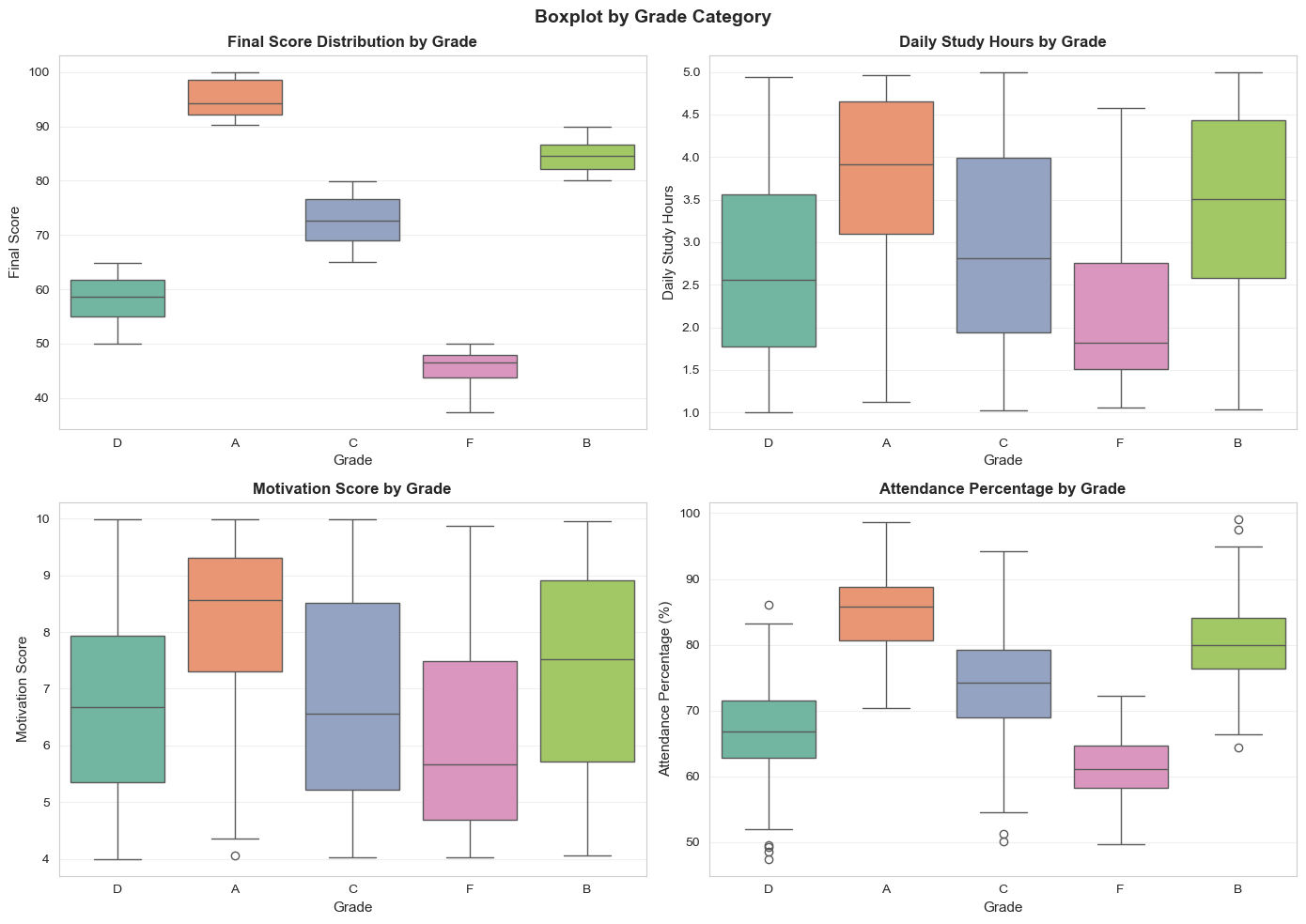 Figure 11: Boxplot by grade category.
Key Findings:
- Grades A → B → C → D → F show decreasing scores (clear)
- INTERESTING: Grade A doesn't necessarily study the most hours! — quality > quantity
- Grade A has higher motivation than F
- Grade A has higher attendance than F, but not 100% correlation
Boxplot by Study Environment:
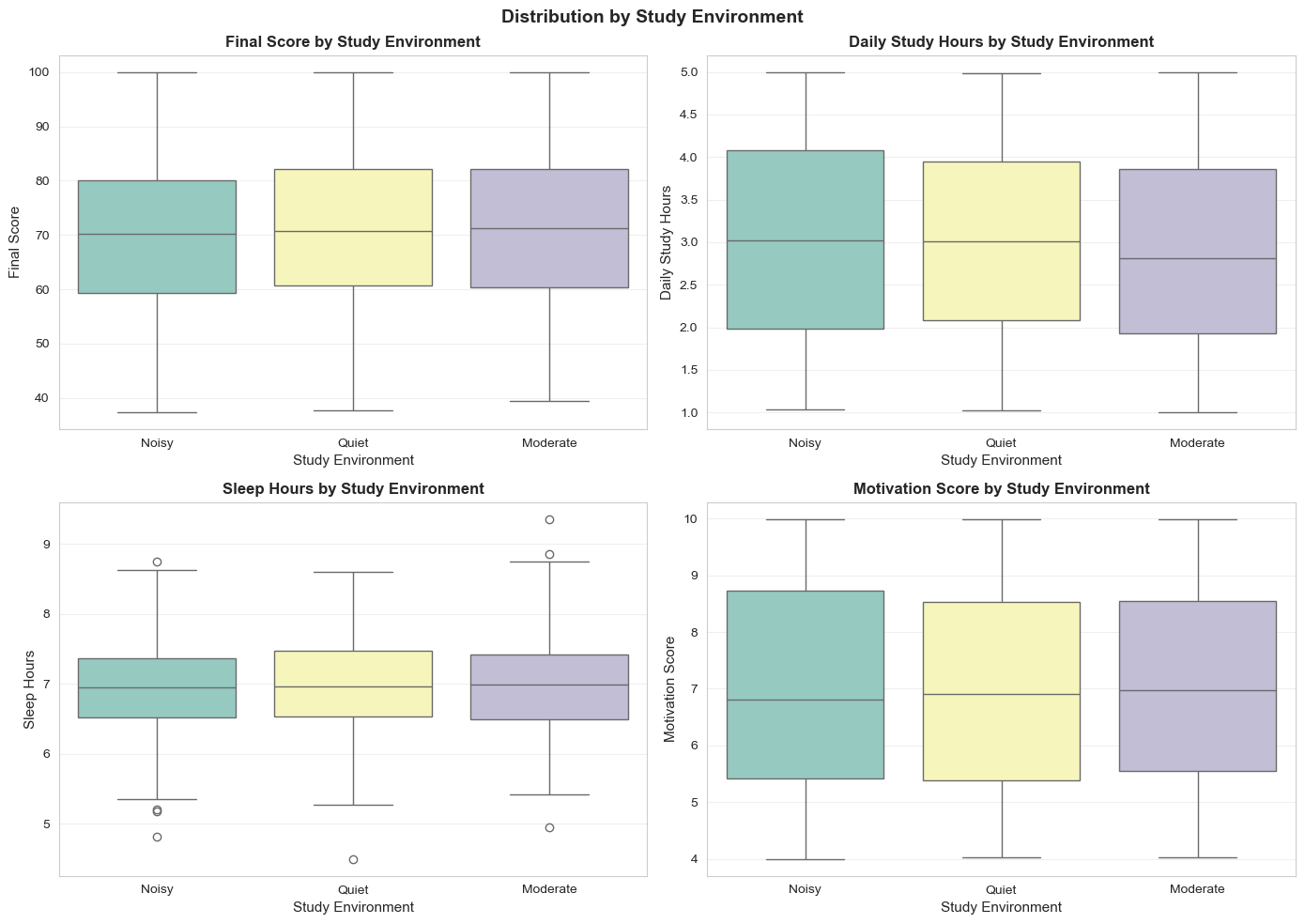 Figure 12: Boxplot by study environment.
- Quiet: median ~72 (highest), but wide variation
- Noisy: median ~70 (2-3 points lower)
- Study Hours: All three environments similar → efficiency > hours
- Motivation: No difference → internal factor
2.6. Outlier Detection - Details
One of the most important applications of Boxplot is outlier detection. We use the IQR (Interquartile Range) formula:
Outliers = Values outside [Q1 - 1.5×IQR, Q3 + 1.5×IQR]
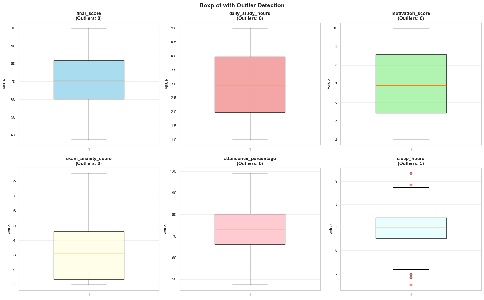 Figure 13: Outliers by IQR rule.
- Final Score: ~4-5% outliers
- Daily Study Hours: ~15-18% outliers (unusual study behavior)
- Motivation Score: ~8-10% (super motivated or unmotivated)
- Attendance: ~3-5% (very diligent or very absent)
How to Handle: Don't carelessly delete! Check for data entry errors first. If real, keep them — they may contain valuable information.
2.7. Combined Analysis: Histogram + Boxplot
For the most comprehensive view, we combine Histogram and Boxplot side by side:
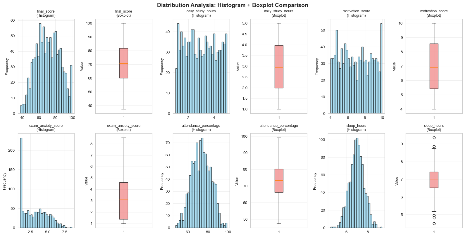 Figure 14: Histogram combined with boxplot.
Benefits of Combination:
- Histogram shows the "big picture" — detailed frequency for each range
- Boxplot shows the "skeleton" — the main structure
- Together, we can identify distribution shape, detect outliers, and decide on data handling
Relationships Between Variables
In data visualization, analyzing relationships between variables is an important step in Exploratory Data Analysis (EDA). This helps us understand whether variables are related, how strong or weak that relationship is, and what overall trends exist in the data.
Through visual charts, we can easily identify:
- Upward or downward trends between variables
- The level of correlation between variables
- Hidden patterns in the data
- Outliers
Two common chart types used to analyze relationships between variables are Scatter Plot and Heatmap.
2.8. Scatter Plot
A Scatter Plot is used to represent the relationship between two numerical variables. Each point on the chart represents one pair of values from the two variables.
Scatter plots help us:
- Identify positive correlation (when X increases, Y also increases)
- Identify negative correlation (when X increases, Y decreases)
- Detect linear or non-linear relationships
- Recognize outliers in the data
For example, we can use scatter plots to analyze relationships such as:
- Study time and scores
- House area and house price
- Advertising cost and revenue
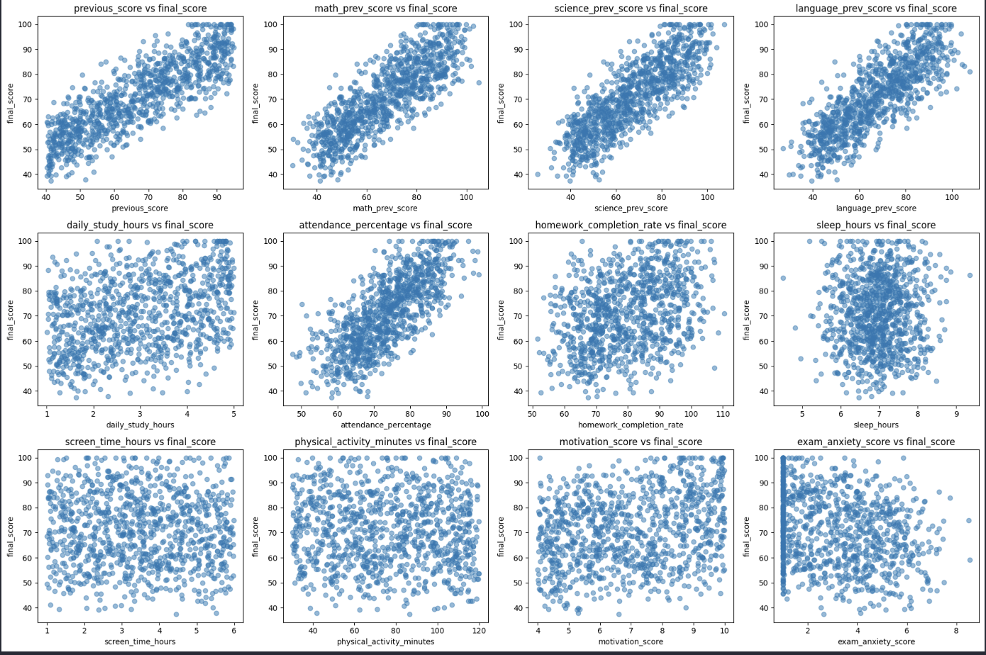 Figure 15: Scatter plot of variable relationships.
2.9. Heatmap
A Heatmap is a chart that uses colors to represent values. In data analysis, heatmaps are often used to display the correlation matrix among multiple variables.
A correlation matrix shows the strength of relationships among numeric variables in a dataset.
Correlation values are usually in the range:
1: perfect positive correlation-1: perfect negative correlation0: no correlation
Heatmaps help us:
- Quickly identify strongly correlated variables
- Detect variables that may contain overlapping information
- Support feature selection in Machine Learning
Example using Seaborn
Where:
df.corr()computes the correlation matrixannot=Truedisplays correlation values in each cellcmap="coolwarm"uses a color scale that helps distinguish correlation levels
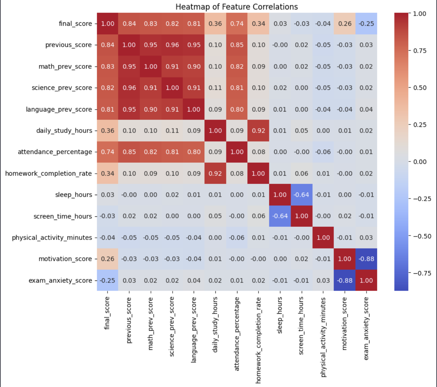 Figure 16: Correlation matrix heatmap.
Typically:
- Red indicates strong positive correlation
- Blue indicates strong negative correlation
- Neutral colors indicate weak correlation
In summary: combining Scatter Plot and Heatmap helps analysts quickly discover important relationships in data, which better supports data analysis and model building.
3. A 5-Step Process for Creating Professional Charts
3.1. Dataset Introduction
In this article, the dataset used is student_performance_interactions.csv. This dataset contains information about students’ academic performance in several subjects, along with many related factors such as previous subject scores, daily study time, attendance rate, assignment completion rate, sleep time, device usage time, learning motivation, exam anxiety level, parents’ education level, and study environment.
This dataset also clearly includes two main types of variables:
- Continuous variables such as final_score, previous_score, daily_study_hours, attendance_percentage
- Categorical variables such as grade, pass_fail, parent_education_level, study_environment
-> Therefore, many different types of charts can be used for analysis.
3.2. A 5-Step Process for Creating Professional Charts
Charts play a very important role in data visualization, dataset description, and future analysis work. If a chart is presented well, readers can gain deeper insights into the dataset.
To keep the code organized and make the chart clear and easy to read, it is recommended to follow the 5-step process below:
Step 1. Prepare the data
In this step, we import the necessary libraries and load the dataset using Pandas. Pandas is a powerful library for data processing. This is the first step to inspect the data, choose suitable variables, and prepare for visualization.
import pandas as pd
import matplotlib.pyplot as plt
import seaborn as sns

df = pd.read_csv("student_performance_interactions.csv")
print(df.head())
import ... as ...: loads the required libraries and assigns short aliases for readability (pd,plt,sns).pd.read_csv(...): reads the CSV file into a DataFrame nameddf.df.head(): prints the first 5 rows for a quick sanity check of columns and value formats.
  student_id  final_score  ... parent_education_level  study_environment
0      S0001    60.137241  ...                 Master              Noisy
1      S0002    99.021977  ...            High School              Quiet
2      S0003    70.522955  ...            High School           Moderate
3      S0004    63.448537  ...            High School              Noisy
4      S0005    66.483019  ...                 Master              Quiet
- This confirms that the dataset was loaded successfully.
- You can immediately identify useful columns such as
final_score,parent_education_level, andstudy_environmentfor plotting.
Step 2. Set up the plotting area
After loading the data, we create a plotting area using Matplotlib. A common approach is to use fig, ax = plt.subplots() so that the chart layout and customization can be controlled more easily.
At this point, we will have an empty plotting space.
fig, ax = plt.subplots(figsize=(8, 5))
figrepresents the full figure canvas, whileaxis the axis area where the chart is drawn.figsize=(8, 5)sets a readable chart size for reports and blog posts.- Separating
figandaxgives better control when adding titles, labels, or multiple subplots.
Step 3. Draw the main chart
Next, we choose a suitable chart type and call a function from Seaborn or Matplotlib to draw it. There are many different chart types, and each one has its own way of being declared and used to represent data. To visualize data as effectively as possible, we need to understand which type of data matches which chart type. For example, if we want to examine the distribution of final scores, we can use a histogram.
sns.histplot(data=df, x="final_score", bins=20, kde=True, ax=ax)
sns.histplot(...)creates a histogram forfinal_score.bins=20divides the value range into 20 intervals to show frequency patterns more clearly.kde=Trueoverlays a smooth density curve to highlight the distribution shape.ax=axensures the chart is drawn on the axis created in Step 2.
Or, if we want to examine the relationship between previous scores and final scores, we can use a scatter plot:
sns.scatterplot(data=df, x="previous_score", y="final_score", ax=ax)
- Each point represents one student with a (
previous_score,final_score) pair. - The overall point trend helps assess whether the relationship is positive, negative, or weak.
- Points far from the main cluster may indicate outliers worth investigating.
Step 4. Styling and customization
If we only draw the chart without labels, readers may not understand what type of data the chart represents. Therefore, after drawing the main chart, we should add descriptive elements such as a title, axis labels, and a legend to make the chart easier to understand.
ax.set_title("Relationship Between Previous Score and Final Score")
ax.set_xlabel("Previous Score")
ax.set_ylabel("Final Score")
ax.legend(title="Data Group")
set_title(...): states the analytical question the chart is answering.set_xlabel(...)andset_ylabel(...): clarify the meaning of both axes.legend(...): adds category guidance when multiple colors or markers are used.
If the chart does not need a legend, legend() can be omitted. In addition, plt.tight_layout() can be used to make the layout neater.
plt.tight_layout()
- Automatically adjusts spacing between chart elements.
- Helps prevent title/label clipping or overlap in the final output.
Step 5. Display or save the chart
Finally, after completing the chart, we can either display it directly on the screen or save it as an image file to include in reports, slides, or documents.
plt.show()
- Displays the chart directly in your coding environment (Notebook/IDE).
- Best for quick iterative analysis and visual checks.
Or save it as a file:
plt.savefig("chart.png", dpi=300, bbox_inches="tight")
savefig(...)exports the chart as an image for reports or blog posts.dpi=300improves output sharpness for publication or printing.bbox_inches="tight"trims unnecessary margins for a cleaner figure.
3.3. Complete Example
Below is a complete example that applies all 5 steps:
import pandas as pd
import matplotlib.pyplot as plt
import seaborn as sns

# Step 1: Prepare the data
df = pd.read_csv("student_performance_interactions.csv")

# Step 2: Set up the plotting area
fig, ax = plt.subplots(figsize=(8, 5))

# Step 3: Draw the main chart
sns.scatterplot(data=df, x="previous_score", y="final_score", ax=ax)

# Step 4: Styling and customization
ax.set_title("Relationship Between Previous Score and Final Score")
ax.set_xlabel("Previous Score")
ax.set_ylabel("Final Score")
plt.tight_layout()

# Step 5: Display the chart
plt.show()
We have the result:
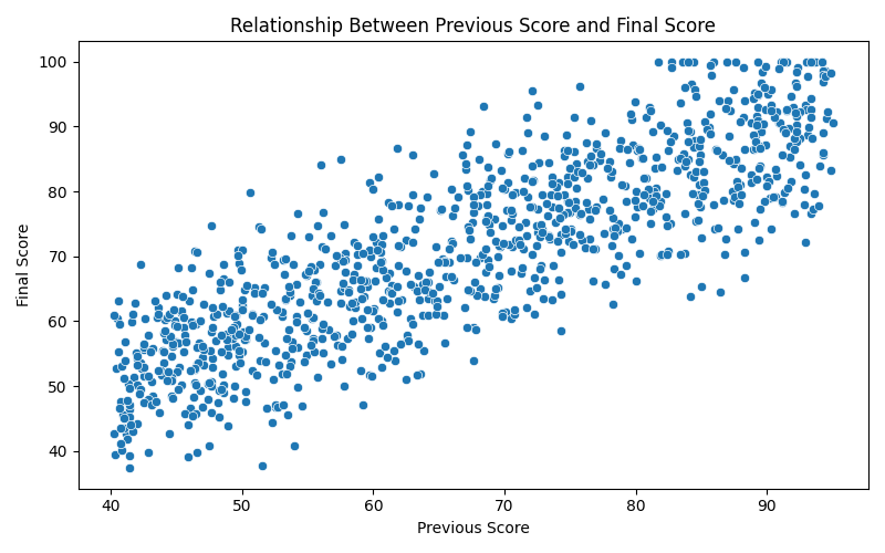 Figure 17: Complete 5-step charting example.
4. Conclusion and Optimization Principles
4.1. Choosing the Right Chart Type
Choosing the wrong chart type can lead to misunderstandings about the scale or relationship of the data.
-
Limit Pie Charts: In professional analysis, pie charts are often restricted, especially when the number of categories exceeds 3-5 groups. Human visual ability to perceive differences in angular area is poorer than comparing lengths (bar charts).
-
Recommendation: Use Horizontal Bar Charts as an alternative when there are many categories or long category names, ensuring readability and accurate comparison.
4.2. Principle of Minimalism and Removing Noise (Chartjunk)
Based on Edward Tufte's theory, the performance of a chart is measured by the "Data-Ink ratio".
-
Eliminate Chartjunk: Remove overly dark gridlines, unnecessary 3D shadow effects, or cluttered borders.
-
Focus on Core Information: Keeping the chart clean helps viewers immediately focus on important trends or outliers.
4.3. Strategy for Using Colors and Palettes
Colors in Seaborn and Matplotlib are not just aesthetic but functional:
-
Use Color Palettes: Choose palettes suitable for the nature of the data:
-
Qualitative palettes: Used for categorical data without order.
-
Sequential palettes: Used for data with continuous variation (low to high).
-
Diverging palettes: Used to emphasize differences from a central point (e.g., negative and positive growth).
-
4.4. Summary
Data visualization with Seaborn and Matplotlib is not just about executing source code, but a thinking process to choose the most honest method of expression for the nature of the data. Adhering to the principles of simplicity and accuracy will help analysts convert complex datasets into information with high practical value.
References
Anscombe, F. J. (1973). Graphs in Statistical Analysis. The American Statistician, 27(1), 17-21.
Knaflic, C. N. (2015). Storytelling with Data. Wiley.
Tukey, J. W. (1977). Exploratory Data Analysis.
Dataset: student_performance_interactions.csv
Chưa có bình luận nào. Hãy là người đầu tiên!